Goodbye Daylight
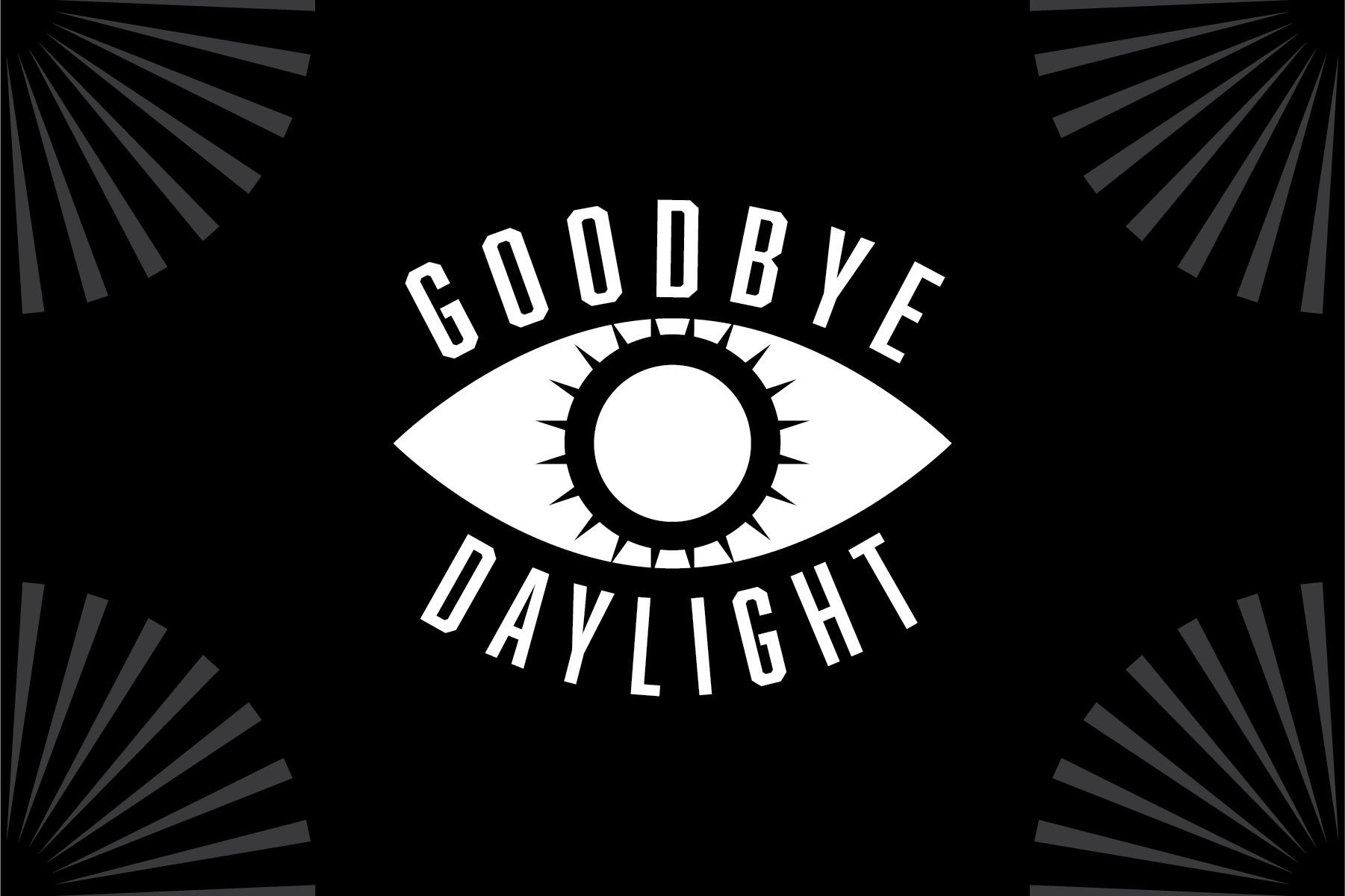
This young NJ-based basement band was looking for a logo an a few assets to jumpstart their presence. We settled on this
main logo, along with an alternate horizontal version which can be seen below.
Working on the EP cover right after allowed us to simultanously build a visual language. The simple, high contrast elements form a strong foundation for the brand
to grow and adjust as needed. This particular illustration was inspired by photos the band members sent me to inform me of the aesthetic and themes they were looking for.
to grow and adjust as needed. This particular illustration was inspired by photos the band members sent me to inform me of the aesthetic and themes they were looking for.
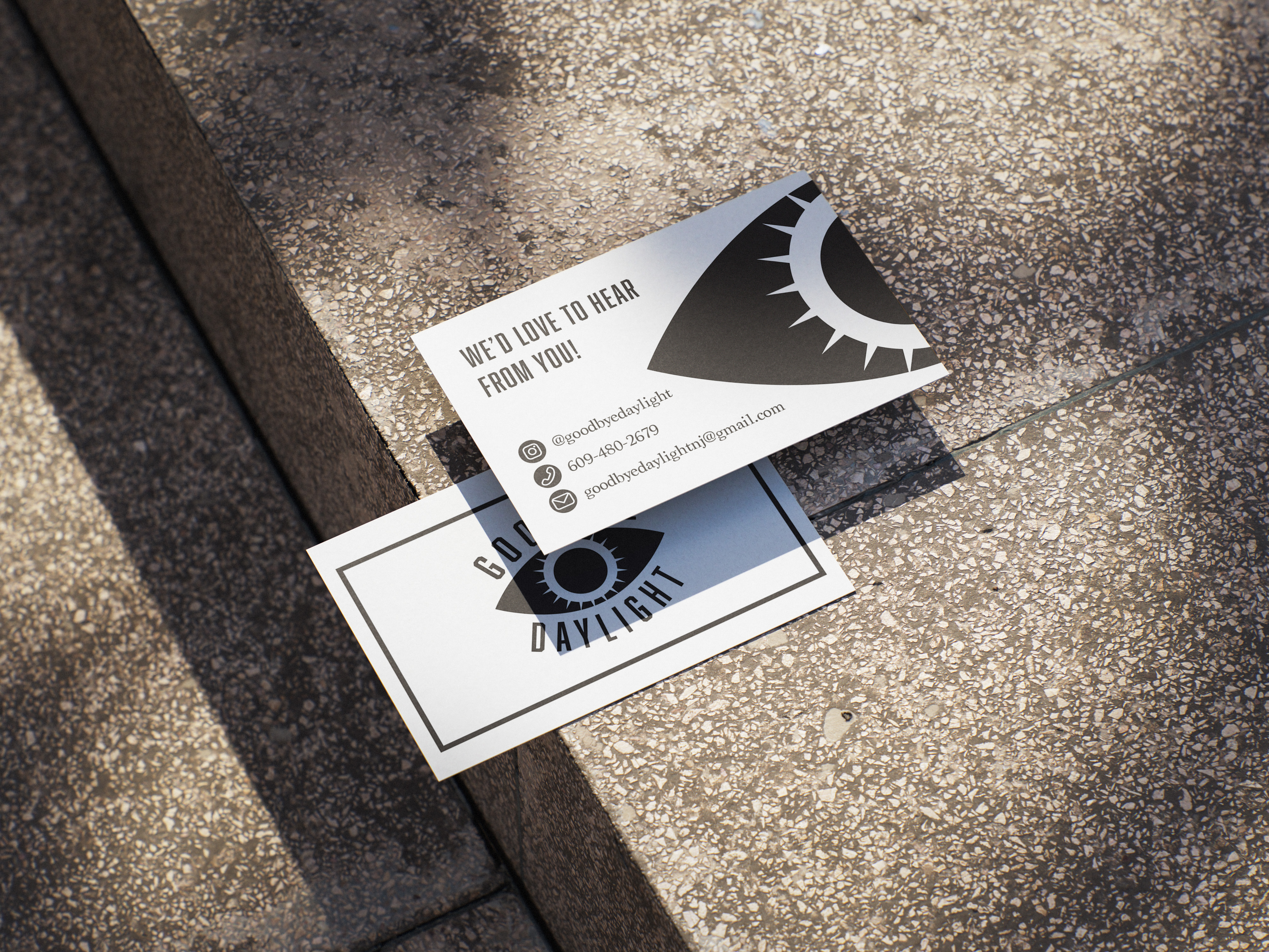
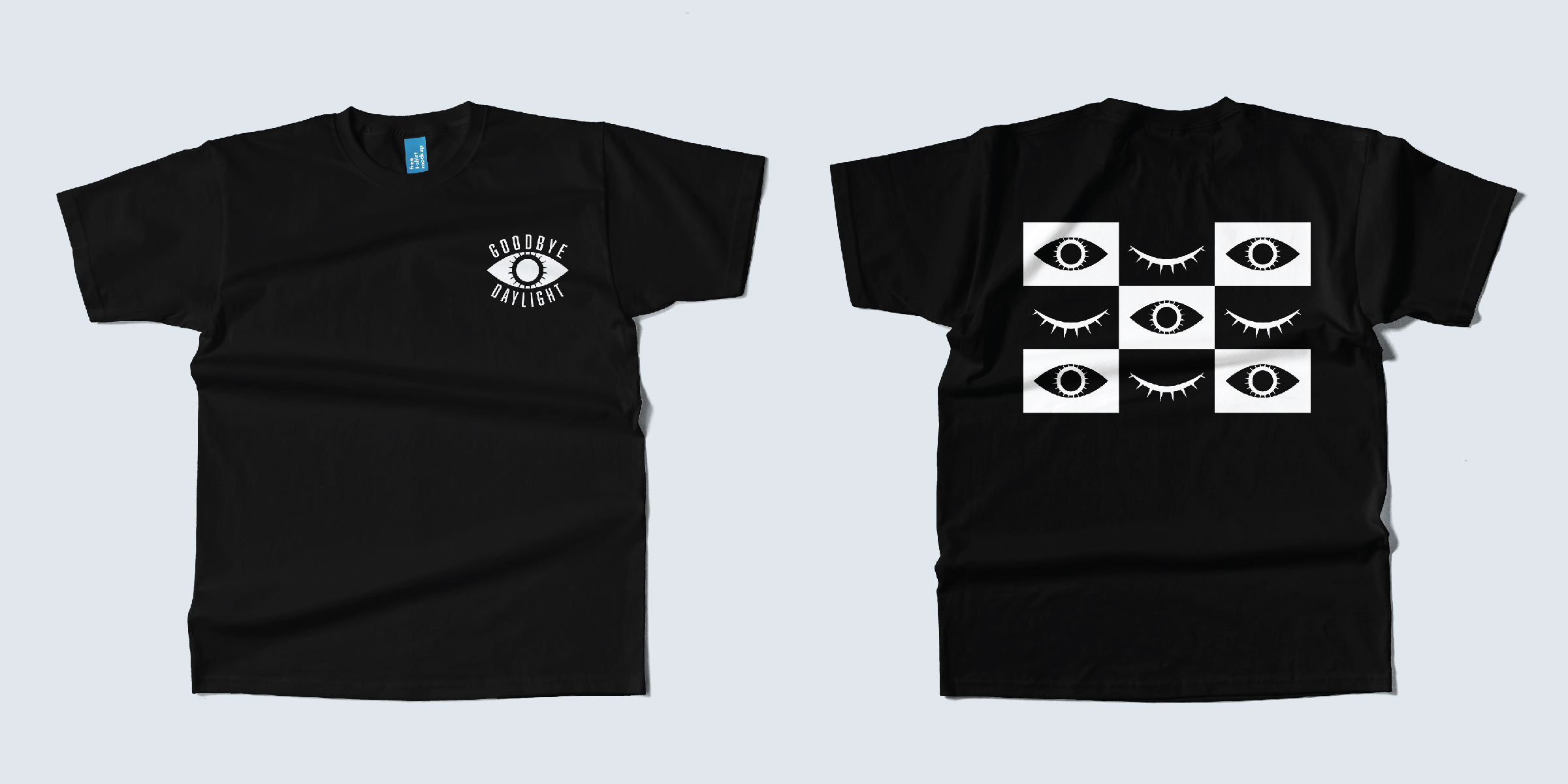
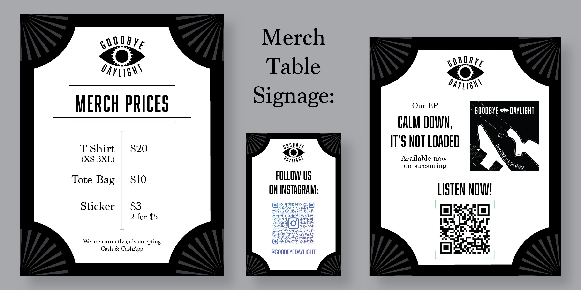
Business cards, shirts, and signage were also created to further their reach. Maintaining the pre-established brand identity was critical, as it would make these touchpoints identifiable and synonomous with Goodbye Daylight moving forward.